Work Collection
UX writing
Overview
I worked on the UX language used across the product as well as in individual screens to streamline and clarify user actions. This included things like our universal navigation, language standards, as well as problem solving individual screens.
I also brought UX writing to our email flows for onboarding and product use messaging.
Approach
It was critical to bring a standardized structure to our product as well as clear actionable screens to build brand loyalty and drive product adoption. I worked cross-functionally to translate complex topics into clear messaging, using user-centered principles and user journey flows.
Universal navigation project
Before
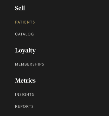
Our app navigation was convoluted, and lacking in clear messaging as well as cohesive brand language that enabled the user to easily get to where they wanted to go.
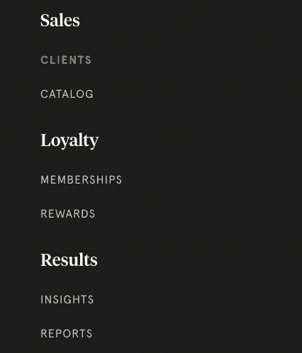
After
After my work on the navigation nomenclature, the roles are clear and streamlined for easy navigation and are in line with the rest of our brand architecture.
Approach
During my interviews with the stakeholder teams and understanding the user needs for these navigation labels, I recognized that grouping our navigation by the actions that users needed to take was incredibly important for ease of use. By understanding how our users were interacting with the features, I was able to create a clear hierarchy for the navigation.
Results
The change in navigation labels allowed for easier navigation and a clear cohesion of our brand language to be applied. Users were now able to quickly see what their options were for accessing each area of sales, loyalty, and results-related activities, reducing frustration and improving navigability.
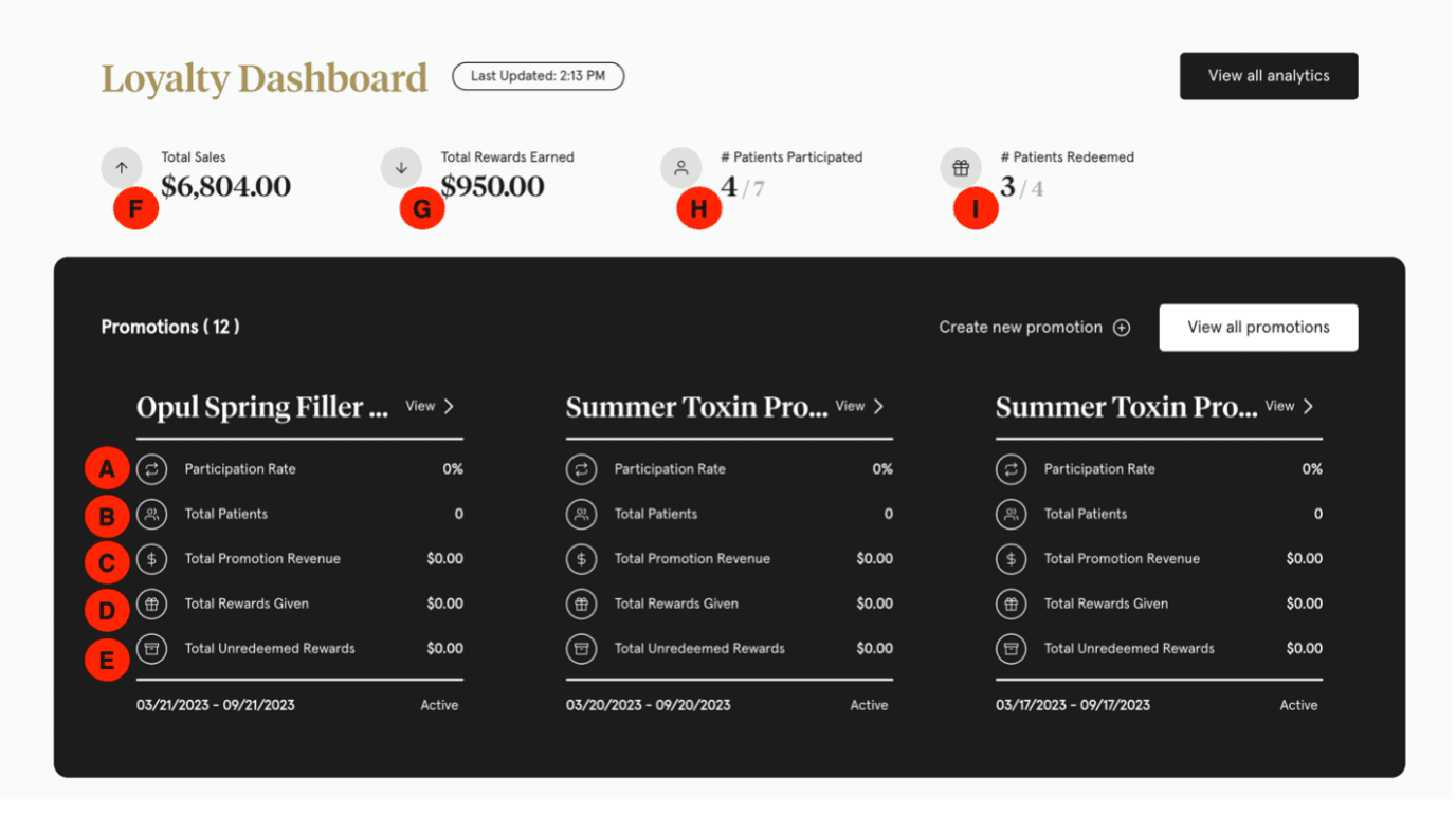
Dashboard nomenclature project
We needed new labels to clearly describe what each metric was showing the user. This project required researching technical definitions, working with stakeholders to determine user needs, and thoughtful clarification of the terms used throughout the dashboard.
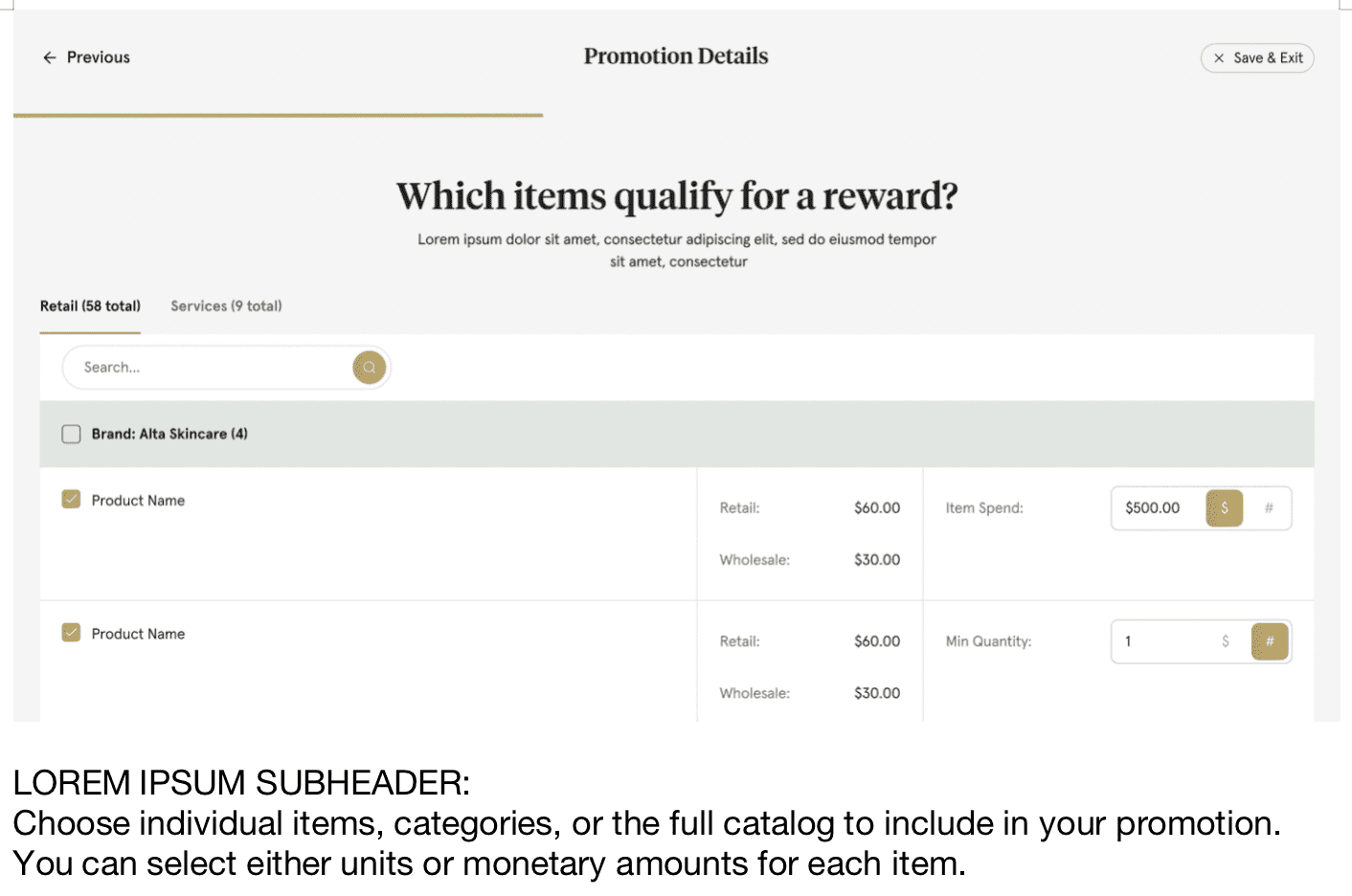
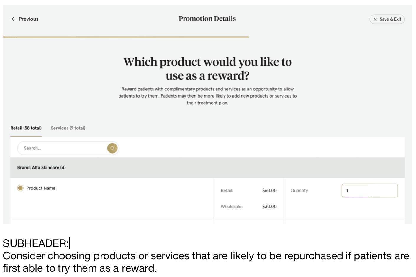
Rewards program setup flow
These screens are a flow designed to help the user walk through setting up a rewards program for their clients. We wanted the copy to be both educational and facilitate setup to streamline onboarding for the user.
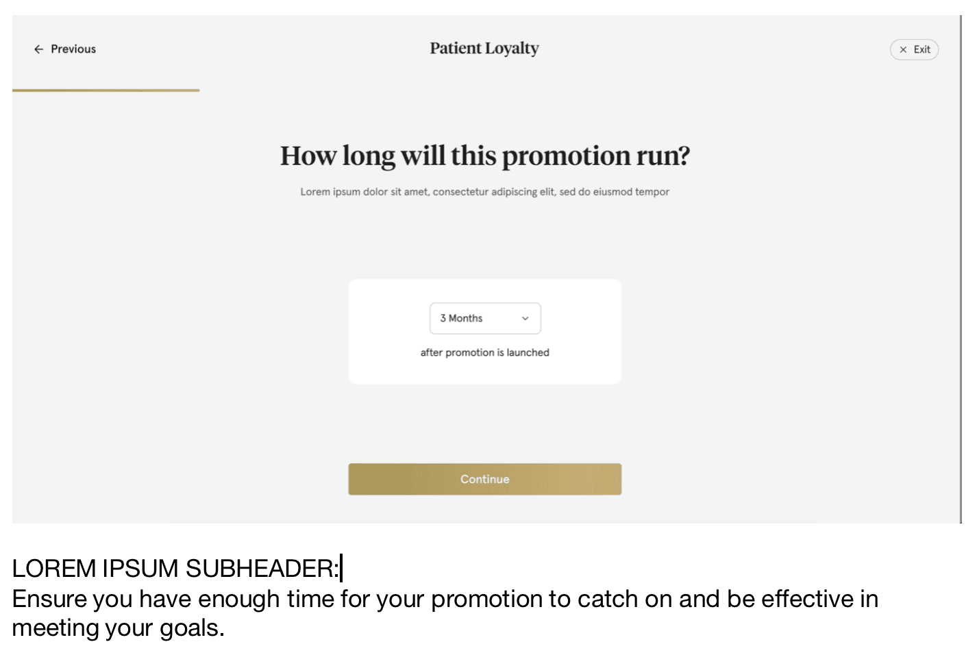
Succinct sub text helps the user understand exactly how to select their desired outcome from the options available.
When multiple options are offered, it's important to give the user support for their choices.
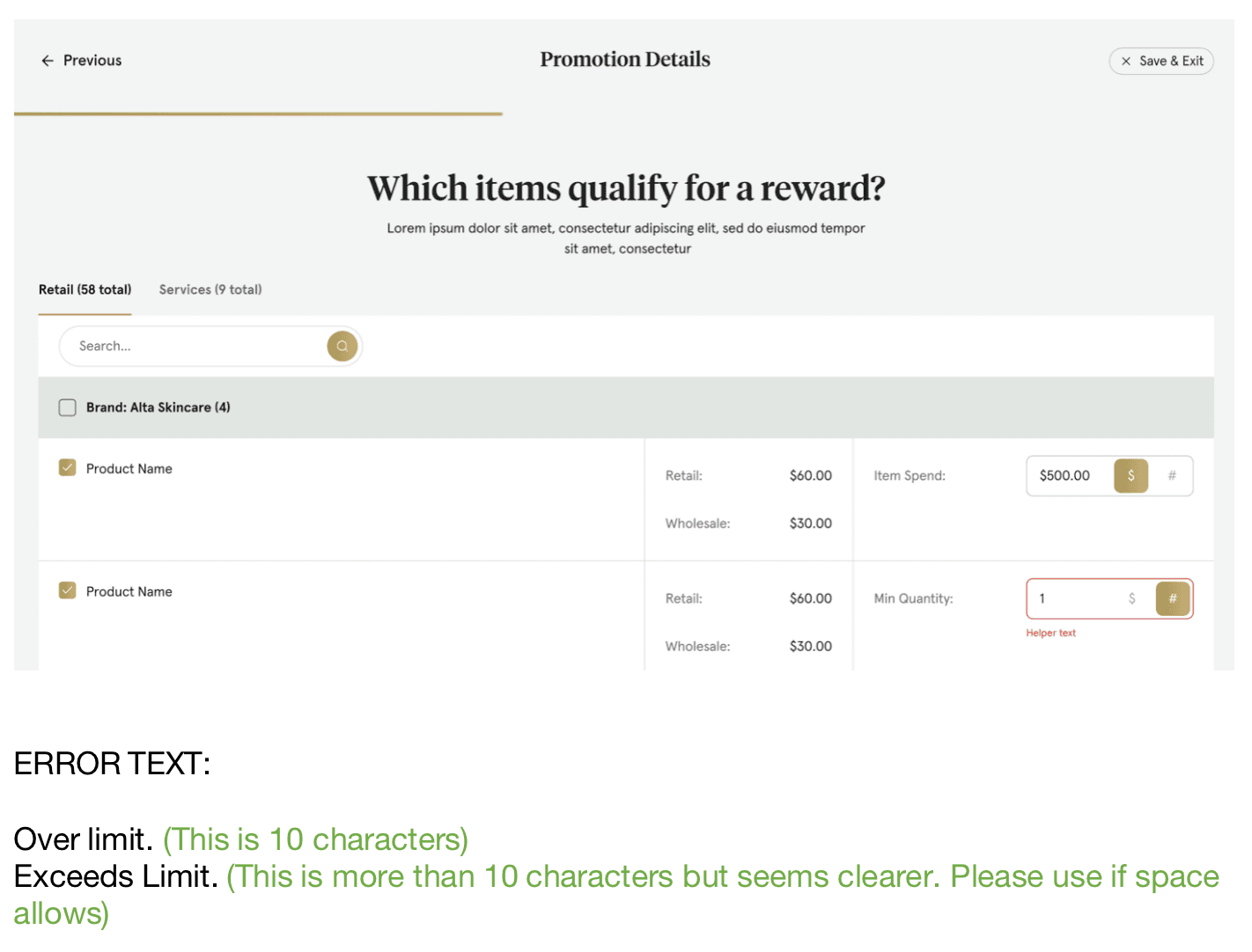
Clear error text is critical in helping redirect the user towards a solution without causing frustration or exits.
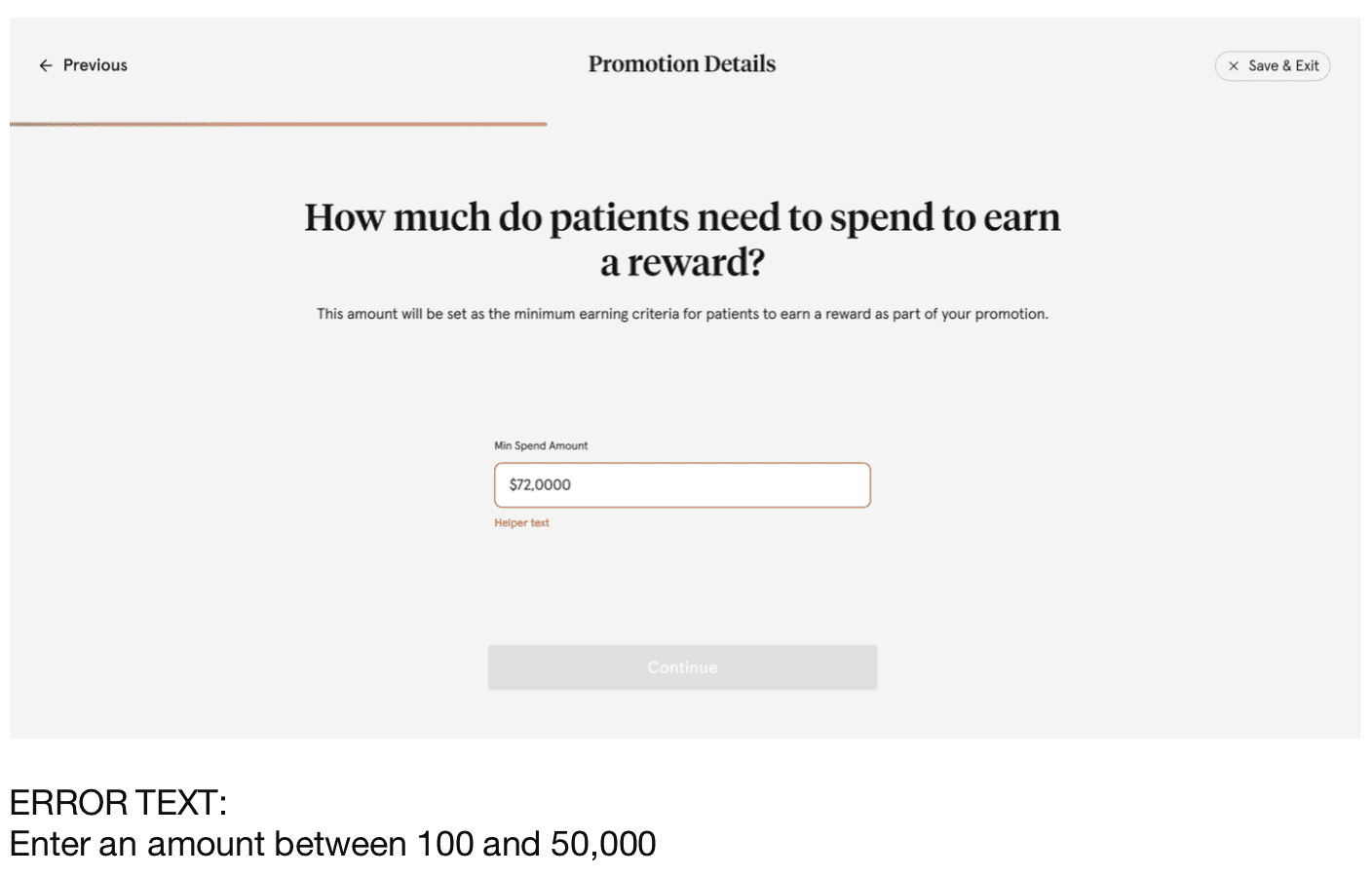
Error text should also give the user information that's relevant to solving their problems when faced with an incorrect input.
To help educate the user and drive adoption, we chose subtext that helped the user think about what they were trying to achieve.
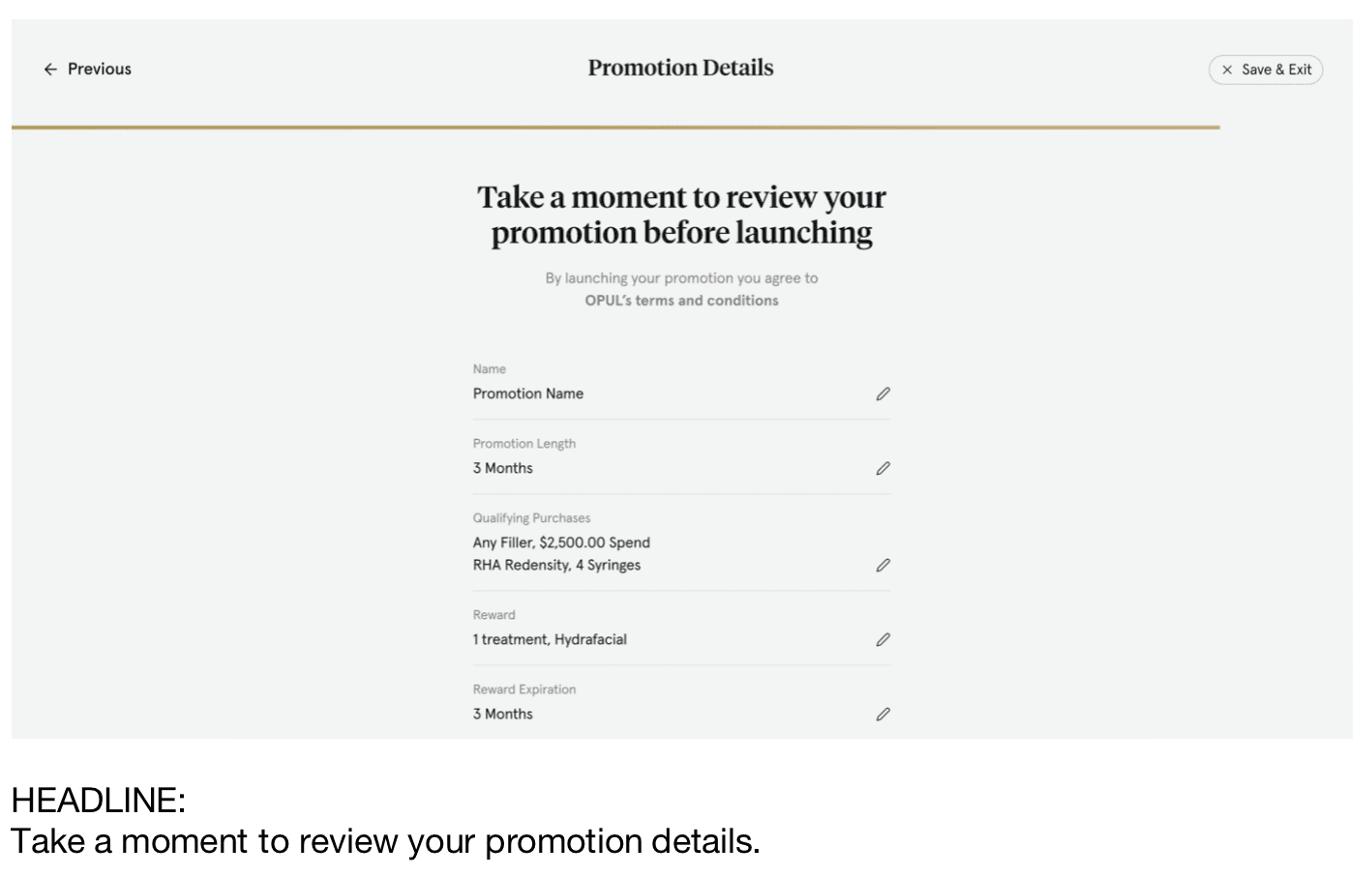
Building in time for the user to review their setup choices was also key in helping them understand the flow of the onboarding.
Email messaging for user adoption
These email flows helped educate users on how to use our service, as well as notifying them of various events such as failed payments, changes to account details, and other important information.
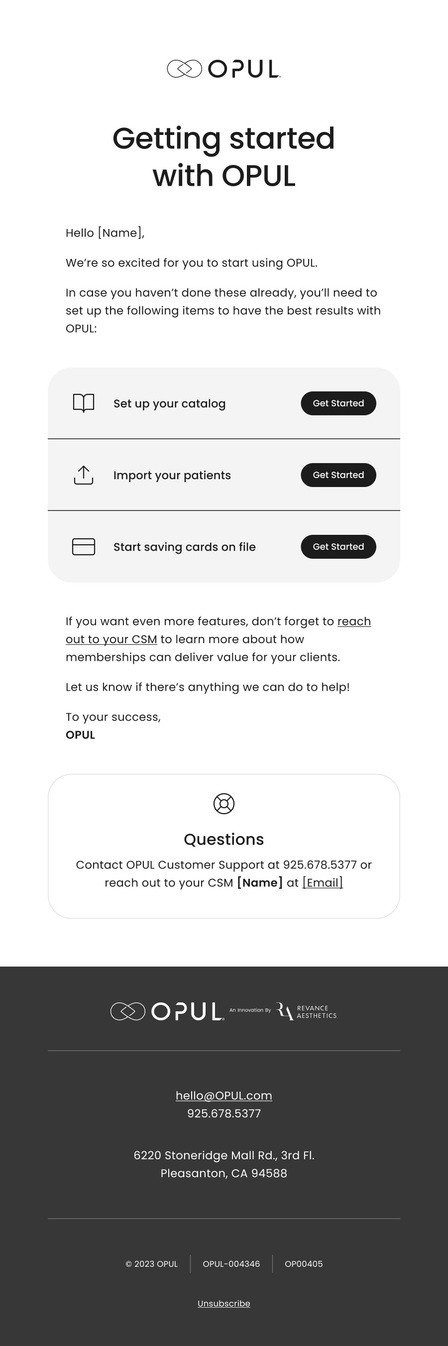
Getting started email
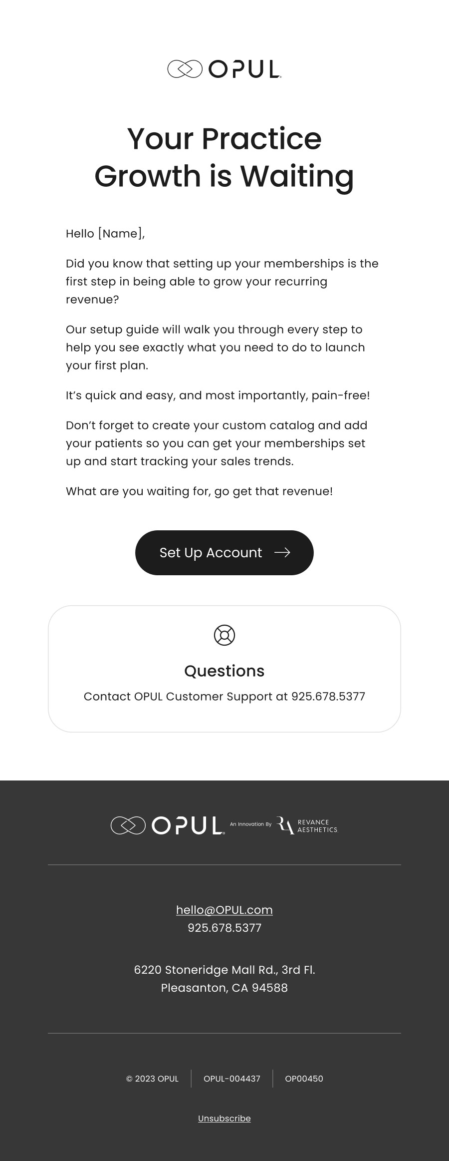
User adoption email
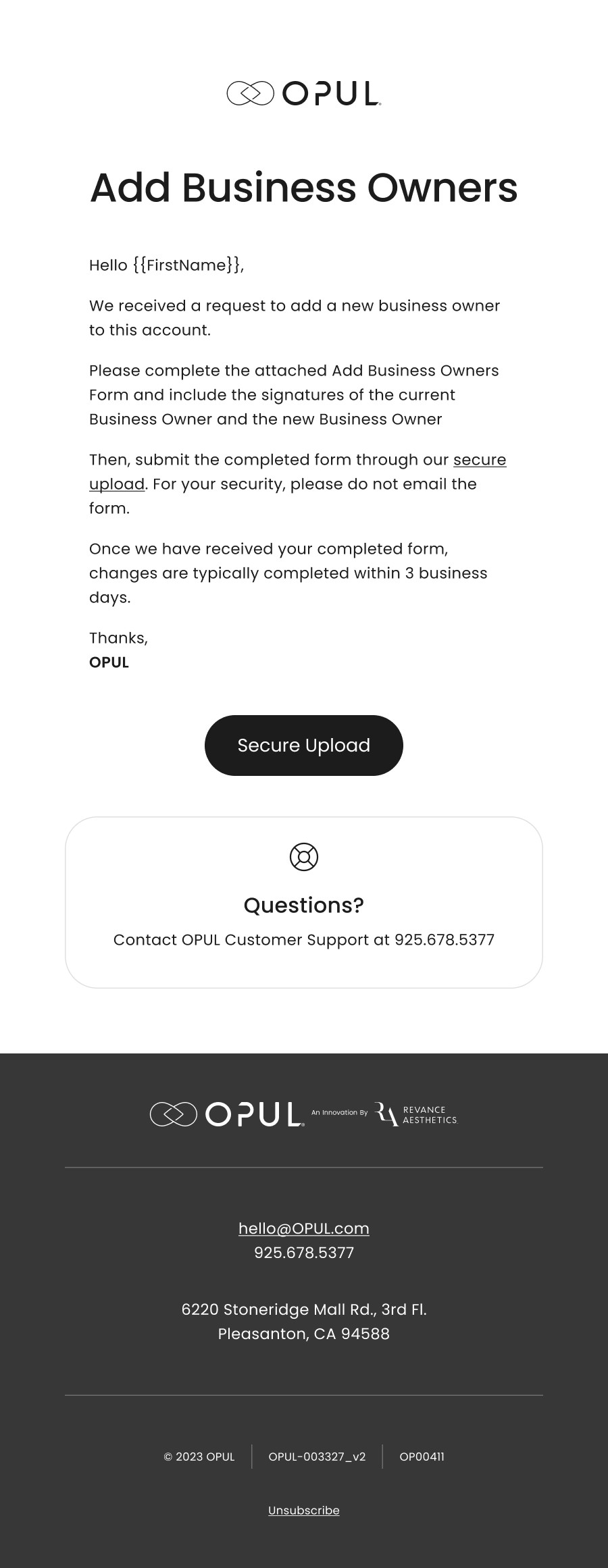
Notice emails
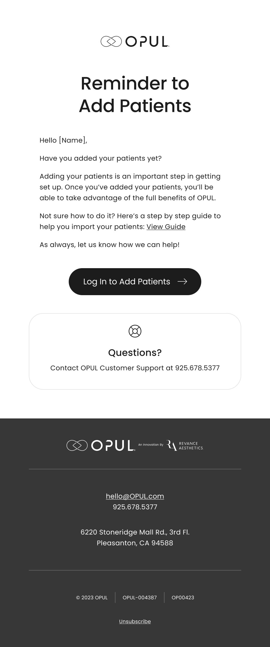
Educational email
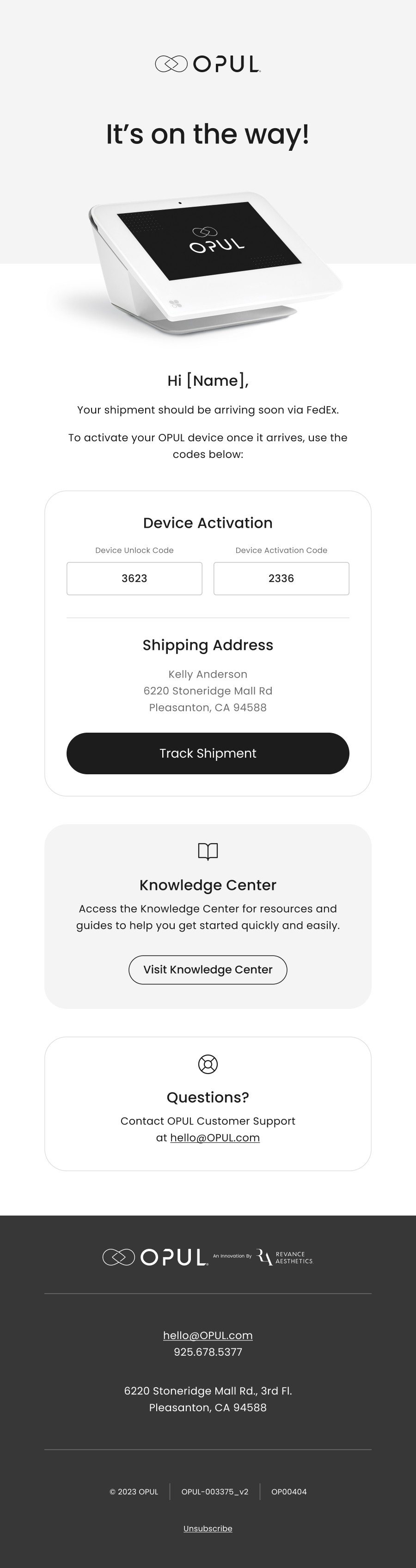
Transactional email
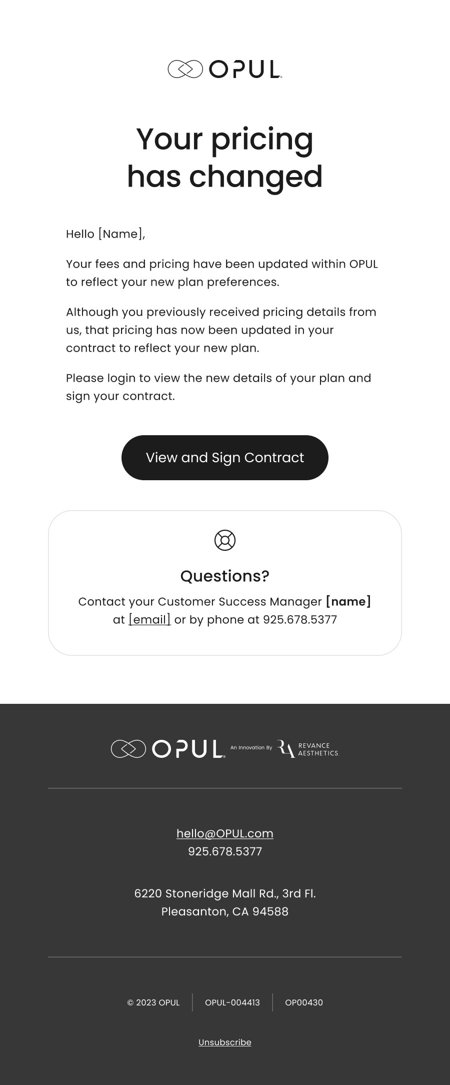
Updated pricing
Approach
Our goal was to help users easily setup their programs, and to reduce the amount of time our customer service teams needed to spend on each client. By understanding pain points, we were able to educate and circumvent many onboarding issues through these email flows. We reduced friction for users and improved usage by introducing clear, educational and logical user flows.
Results
Shortly after implementing these flows, 6+ users resolved onboarding issues after receiving emails. 31 customers had green usage checks, and 0 customers had red usage checks.
Ready to get in touch?
© Anna Steininger 2024
Designed by Anna Steininger